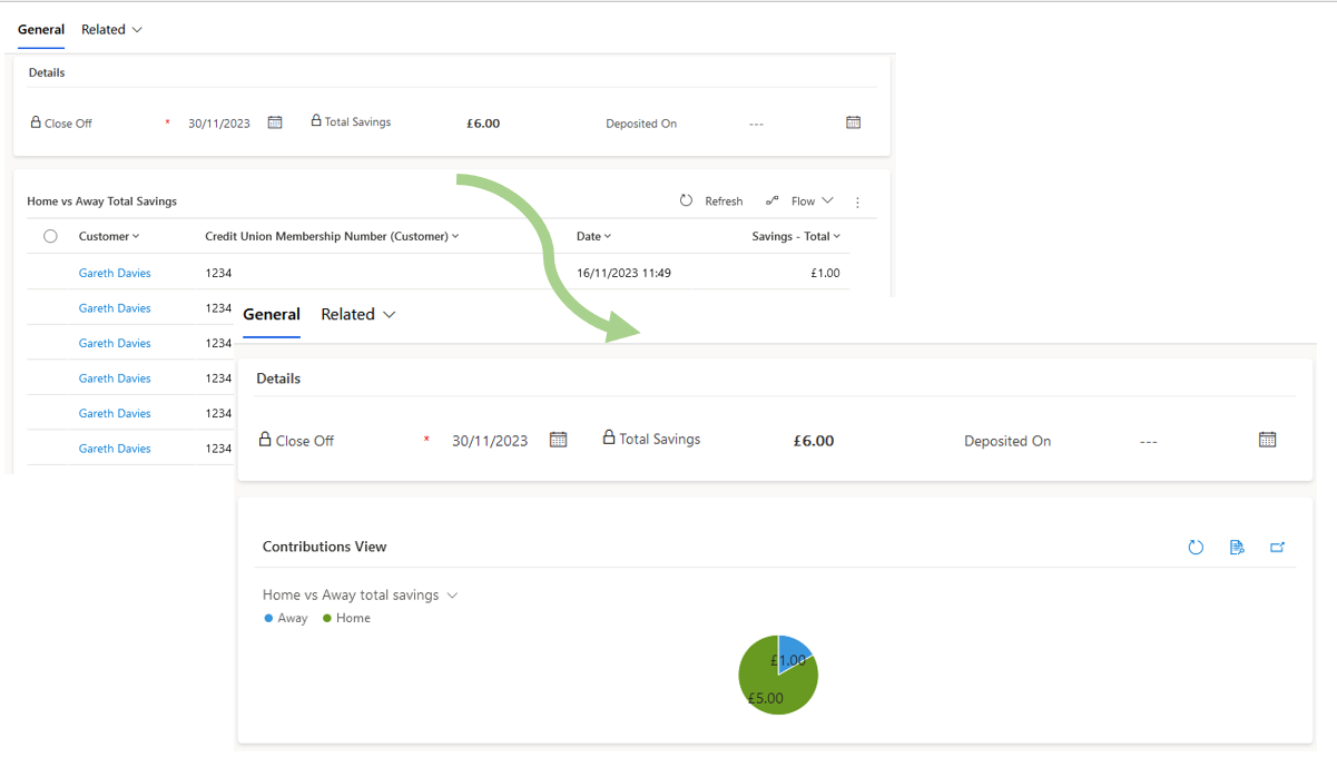
Many are familiar with displaying charts alongside grids in Dynamics 365, but a lesser-known feature allows you to just show the chart in a form.
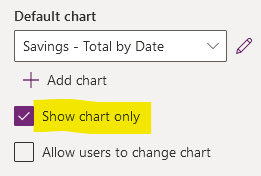
Achieving this is straightforward in the new form editor. Simply choose your subgrid and activate the 'Show Chart Only' checkbox. For added flexibility, you can enable the 'Allow users to change chart' option.

This takes our from from drab to slightly less drab... The potential is there but the default chart size somewhat limits its practicality.

Now, you might wonder, how can we resize this chart for better usability?
Now we have successfully surfaced a chart on our form it's only reasonable for us to want to resize it. Unfortunately this is not as easy as one could hope.
One might assume that increasing the 'Maximum number of rows' property on the subgrid would do the trick. This was a valid approach back in 2016, and recommended by the CRM Chart Guy . But as of December 2023, this method no longer impacts the chart size, and neither does the 'Use available space' option.
Fortunately, I have discovered a solution: editing the form XML, a method officially supported for customization. The crucial step is altering the `rowspan`` property. The most efficient tool I have found for this task is the Form XML Manager in XrmToolbox. It enables editing and rapid republishing of the XML, allowing for experimentation with different rowspan values to achieve the desired chart size.
<cell locklevel="0" id="{6787823b-9029-4777-a933-764e726edf4a}" rowspan="8" colspan="1" auto="true"
    showlabel="true">
    <labels>
        <label description="Home vs Away Total Savings" languagecode="1033" />
    </labels>
    <control indicationOfSubgrid="true" id="Subgrid_new_2"
        classid="{E7A81278-8635-4D9E-8D4D-59480B391C5B}">
        <parameters>
            <RecordsPerPage>250</RecordsPerPage>
            <AutoExpand>Auto</AutoExpand>
            <EnableQuickFind>false</EnableQuickFind>
            <EnableViewPicker>false</EnableViewPicker>
            <EnableChartPicker>true</EnableChartPicker>
            <ChartGridMode>Chart</ChartGridMode>
            <TargetEntityType>tn_visit</TargetEntityType>
            <ViewId>{02AF3A75-BF87-EE11-BE36-6045BDD0EDF1}</ViewId>
            <ViewIds>{A95A8474-2567-4F84-B6B2-A09E9E52575A},{02AF3A75-BF87-EE11-BE36-6045BDD0EDF1}</ViewIds>
            <RelationshipName>tn_SavingsBatch_tn_SavingsBatch_tn_Visit</RelationshipName>
            <VisualizationId>{DE63F41E-C287-EE11-BE36-6045BDD27787}</VisualizationId>
        </parameters>
    </control>
</cell>
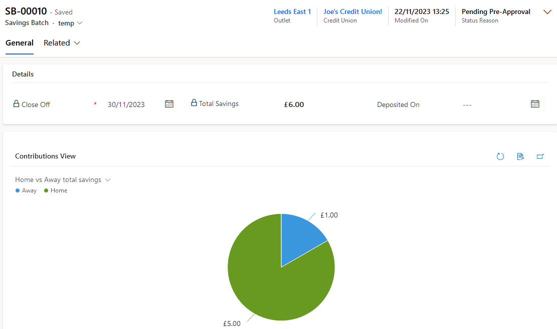
Once we adjust the rowspan from 4 to 8, the true potential of charts on forms becomes evident.

The real strength of these form-level charts lies in their flexibility: users can change both the data source view and the chart type.
For example, sales teams can greatly benefit from this feature. Embedded charts on forms can track individual or team performance metrics. Imagine a chart displaying monthly sales totals. Users can not only switch views to compare different product lines or regions but also adjust the time frame of the data displayed via the view switcher, whether it's the last 3, 6, 9 months, or any other period. This adaptability transforms forms into dynamic tools for real-time performance tracking.
The key take away is the rowspan property in the XML, with it charts become a viable and valuable addition to your Dynamics365 Forms!
